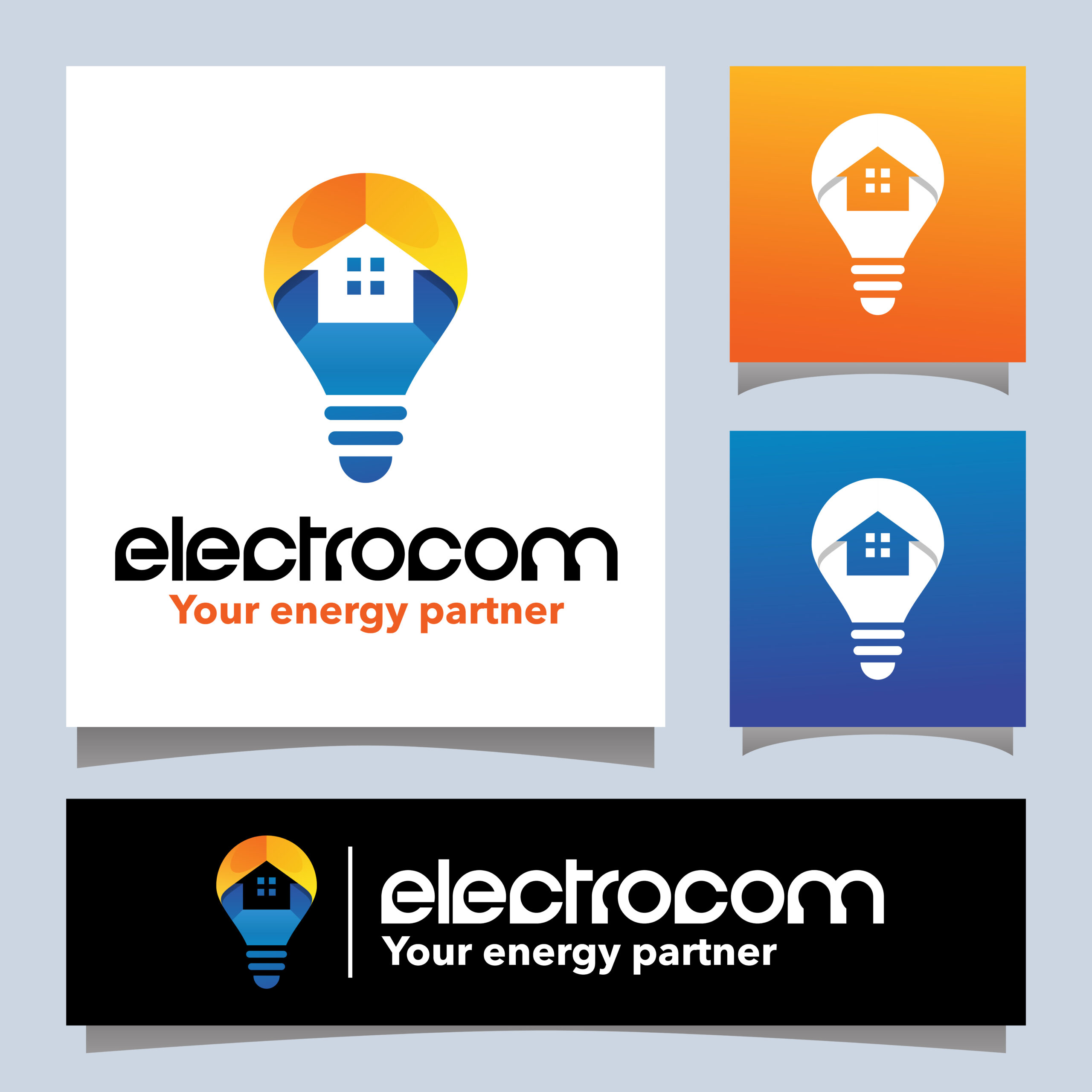
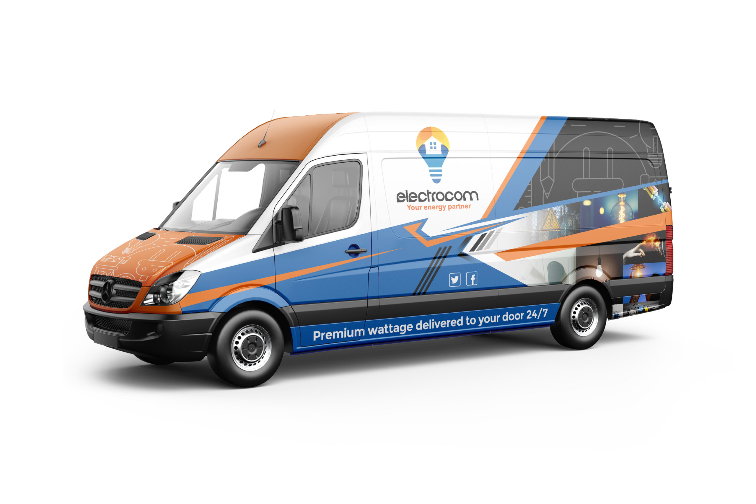
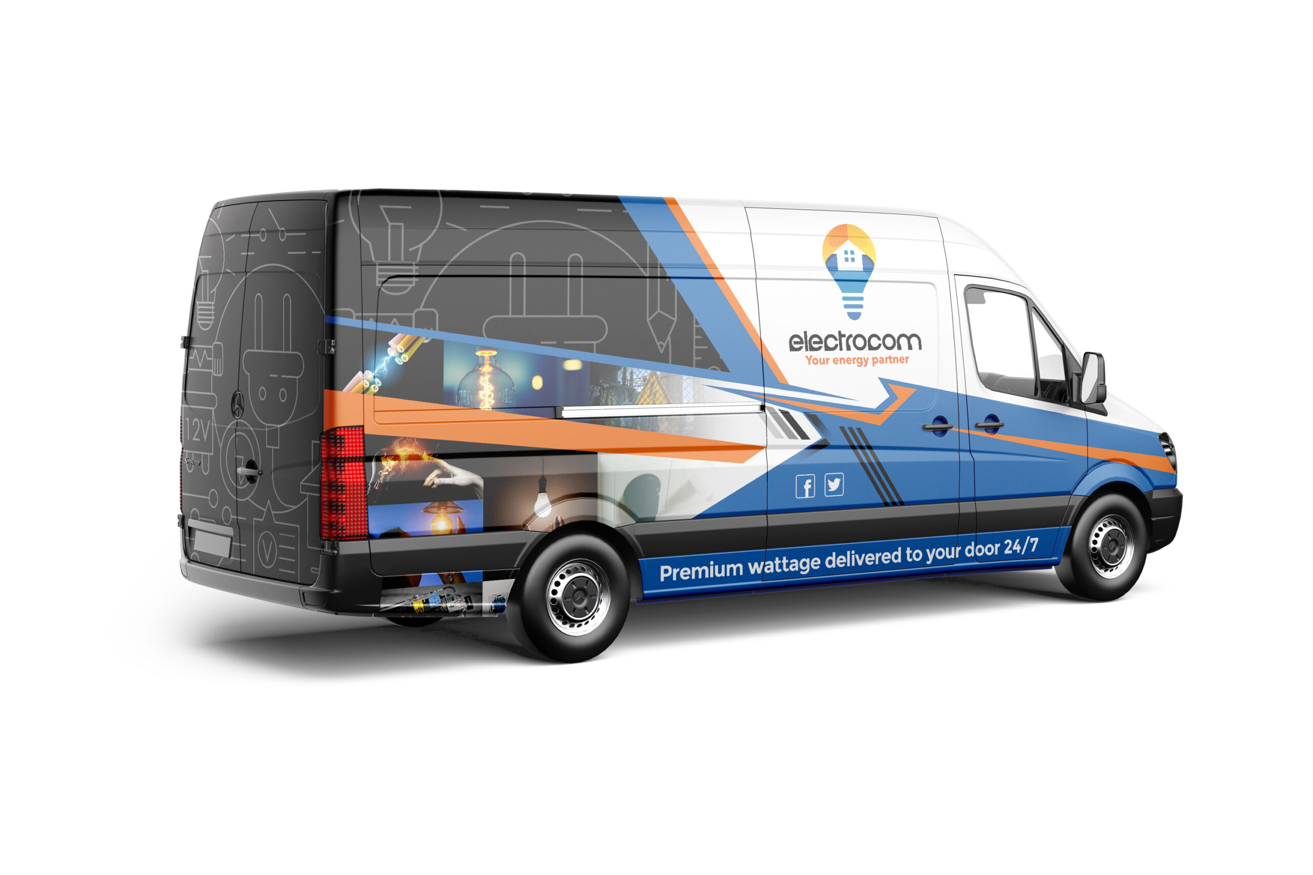
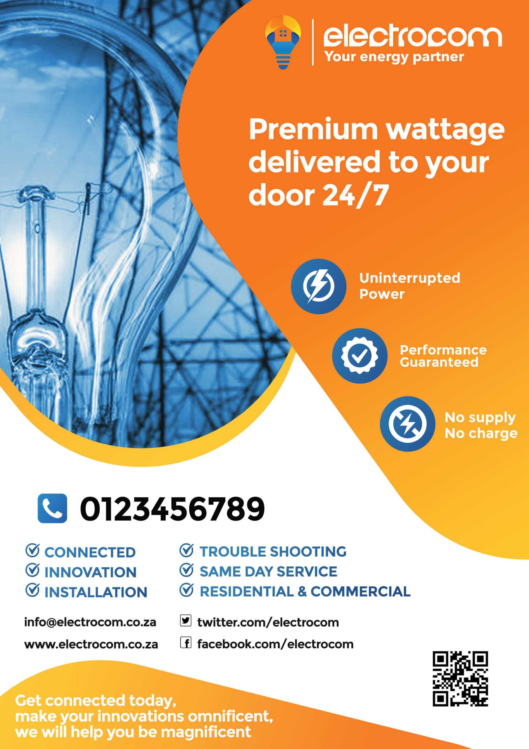
I chose the colors blue and orange because those colors can be associated to ELECTRICAL wiring where the blue and orange are both positive wires just like Electrocom having a positive attitude to deliver premium wattage to the rest of South Africa. The house shaped icon inside the light bulb can be seen either as a home or a business property where Electrocom would be delivering uninterrupted power. Efosa Ojomo once said "When a ligth bulb is more than just a light bulb; the power of market-creating innovation". With that being said, Electrocom will make your innovations, which is usually associated with a light bulb, omnificent so that is why I also added a light bulb into my design.
Like this design? Vote it up!

