Reezah Abrahams – Electrocom
Designed By
Reezah
Website
About This Design
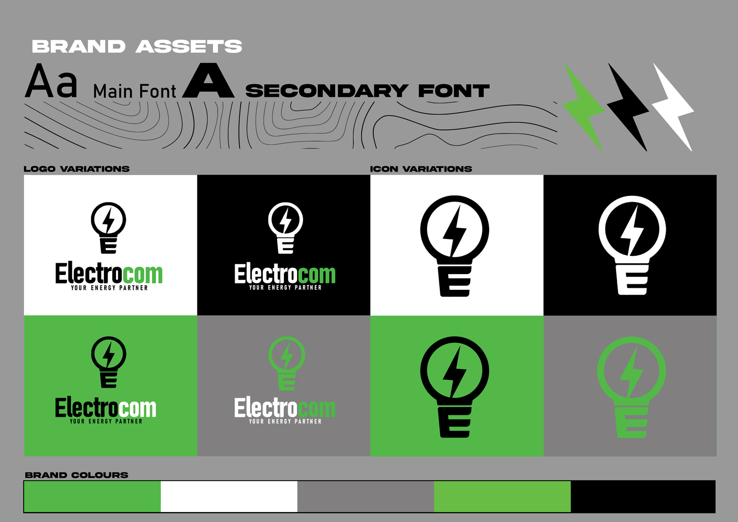
I am a self-taught graphics designer. I entered this competition to test my skills and challenge myself. My thought process when coming up with the brand identity was how do I create a unique brand and image while still being familiar.
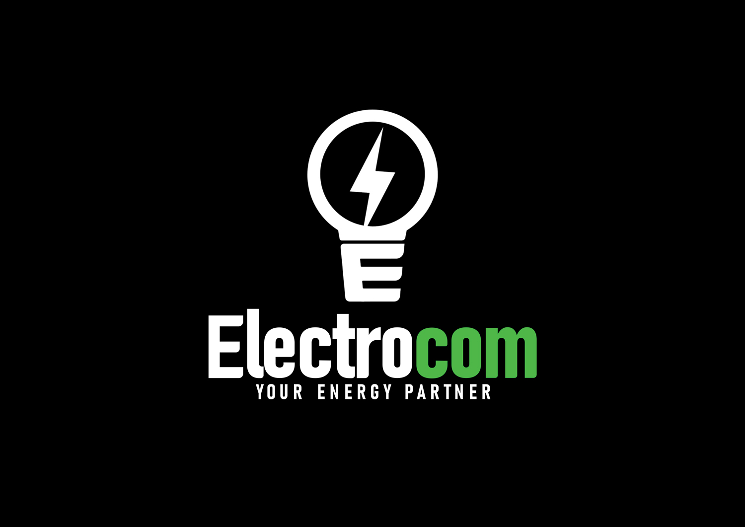
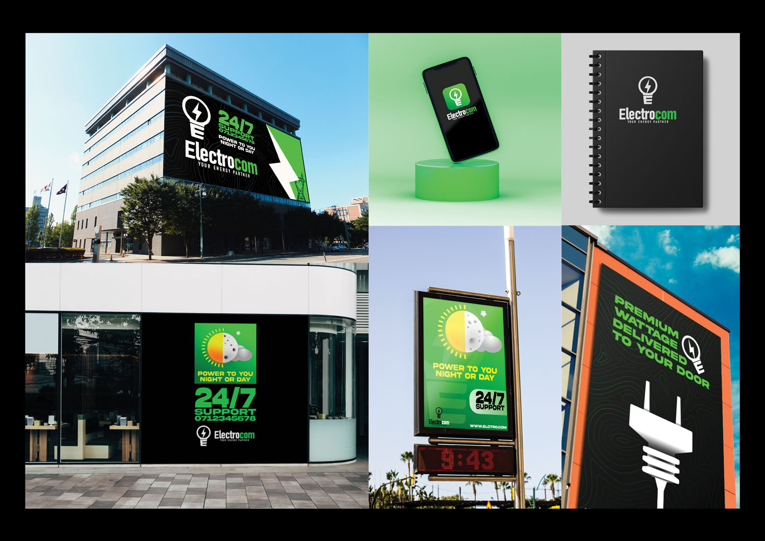
The Logo: I created the logo in the form of a lightbulb to symbolise power and electricity which is the core of this business. The "E" represents the screwing in part of the bulb which speaks to the brands name but also symbolises that 'Electrocom" is the connection between your power and the grid.
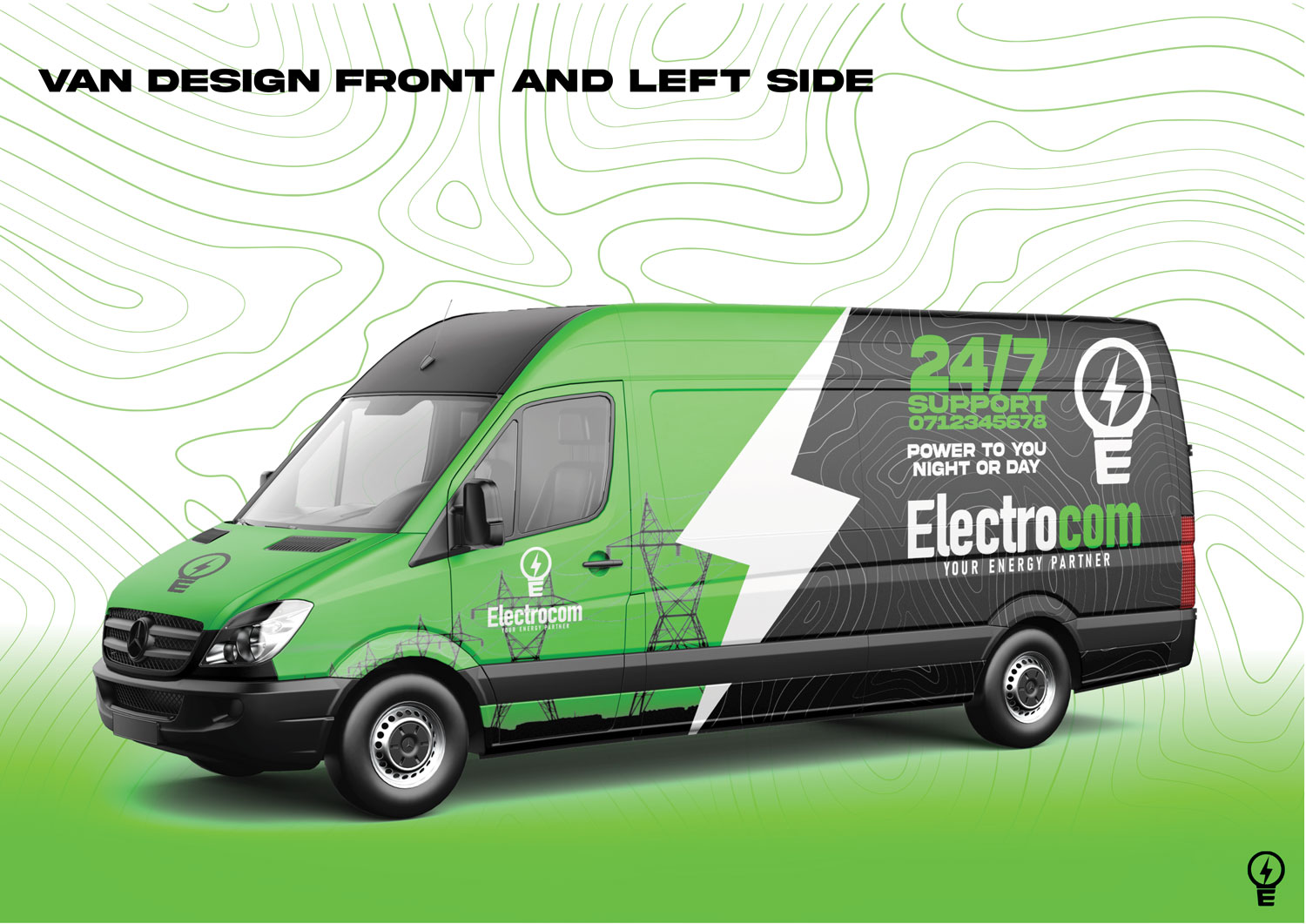
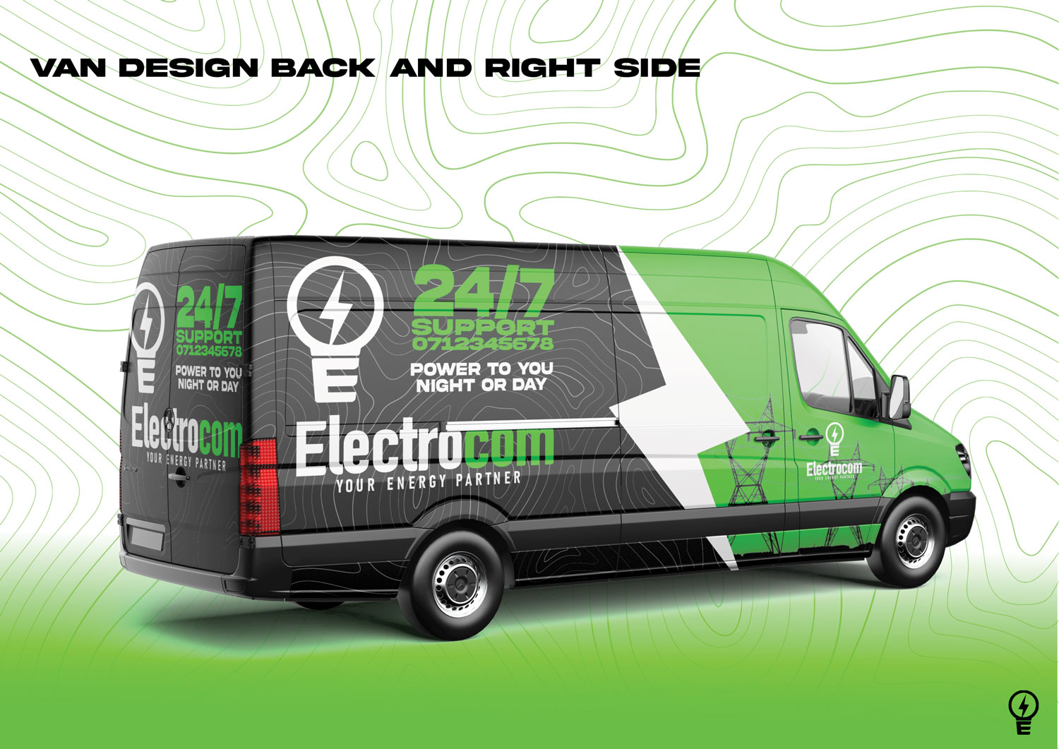
The Van Design: I wanted to create a design and color pattern that when you see it driving down the street you know what it is without looking at the logo.
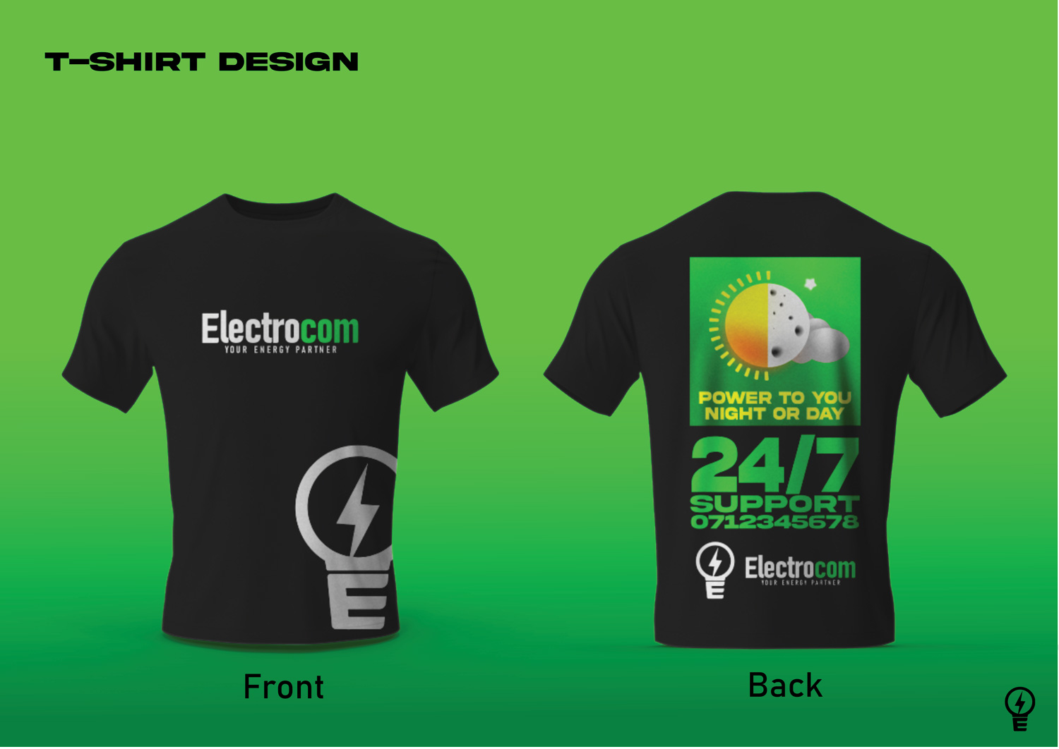
The T-Shirt Design: Easily recognisable and speaks to the core design elements of the brand.
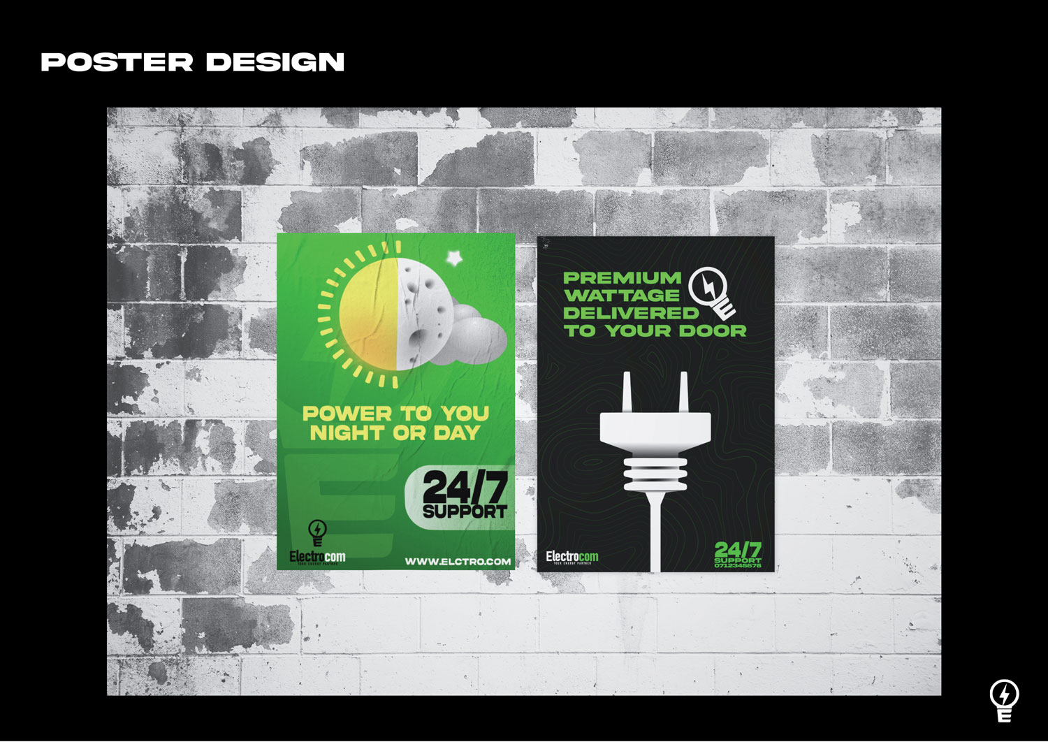
The Poster Design: The poster designs use imagery that works hand in hand with the core ideas of the brand like " power to you night or day" and " premium wattage delivered to your door".
Like this design? Vote it up!

