Jose Antonio Kabeya – Electrocom
Designed By
Jose Antonio
Website
About This Design
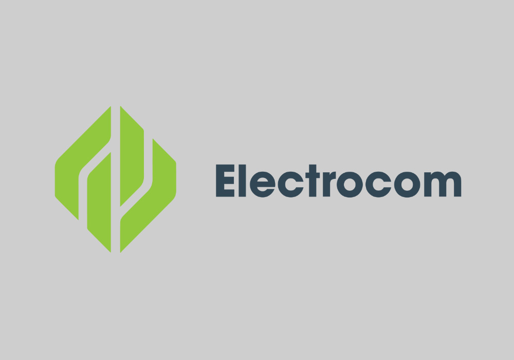
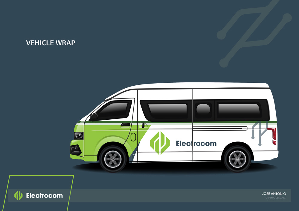
Inspiration - The inspiration for the Electrocom logo design came from the company's commitment to providing uninterrupted power supply 24/7, enhancing both home and business environments in South Africa. I aimed to create a logo that is modern, dynamic, and conveys the essence of reliability and energy.
Background and Process - Conceptualisation: Understanding the importance of continuous power, I wanted the logo to symbolise stability and efficiency. The design had to reflect Electrocom's promise of delivering power without fail, while also being versatile enough to represent both residential and commercial uses.
Design Elements- The logo features a geometric design that incorporates clean lines and a strong, stable form. The central motif is abstract yet recognisable, suggesting a fusion of electrical components and energy flow. This symbolises the seamless integration of power in daily life, from "keeping your family cool" to "powering your machines."
Color Choice - I selected a deep, calming green for the logo. This color represents growth, reliability, and sustainability. It also stands out against both light and dark backgrounds, ensuring the logo remains impactful across various mediums and applications.
Typography - The word "Electrocom" is presented in a clean, Helvetica Neue font that exudes modernity and professionalism. The simplicity of the typeface complements the complexity of the logo mark, ensuring that the text is clear and legible at any size.
Digital Creation - Using Adobe Illustrator, I started with basic shapes, refining them into the final geometric design. The process involved multiple iterations to achieve the perfect balance and symmetry, ensuring the logo is both aesthetically pleasing and functional.
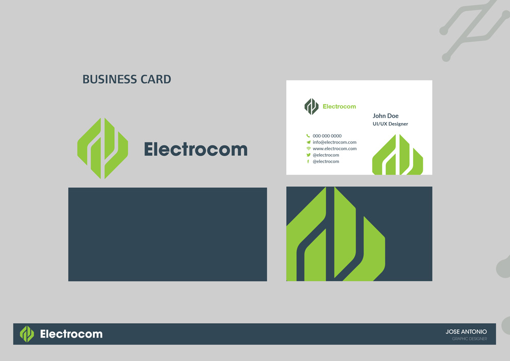
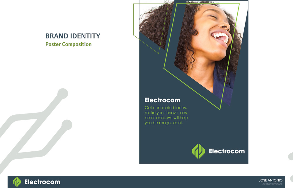
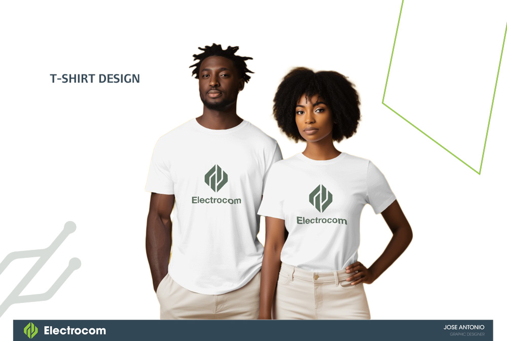
Refinement - I tested the logo in various sizes and contexts to ensure its versatility. From business cards to billboards, the design needed to maintain its integrity and readability. I also explored different color variations to confirm that the chosen green would be effective in all scenarios.
Like this design? Vote it up!

