Deborah Omiema-Briggs – Electrocom
Designed By
Deborah
Website
About This Design
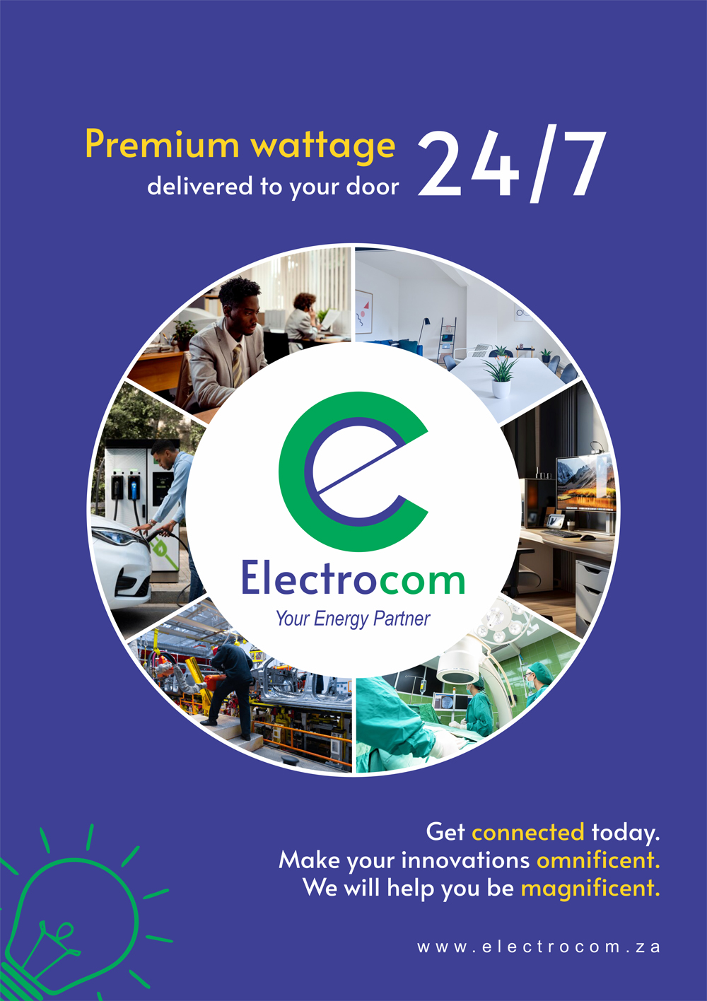
Electrocom is the common man's dream. There's so much we could be and do as Africans with premium wattage delivered to our door 24/7.
Electrocom > Electricity > Energy > Enthusiasm > Empowerment > Elevation > Enriching > Exhilarating > Emboldening. The Electrocom brand emboldens us to be whatever we dream.
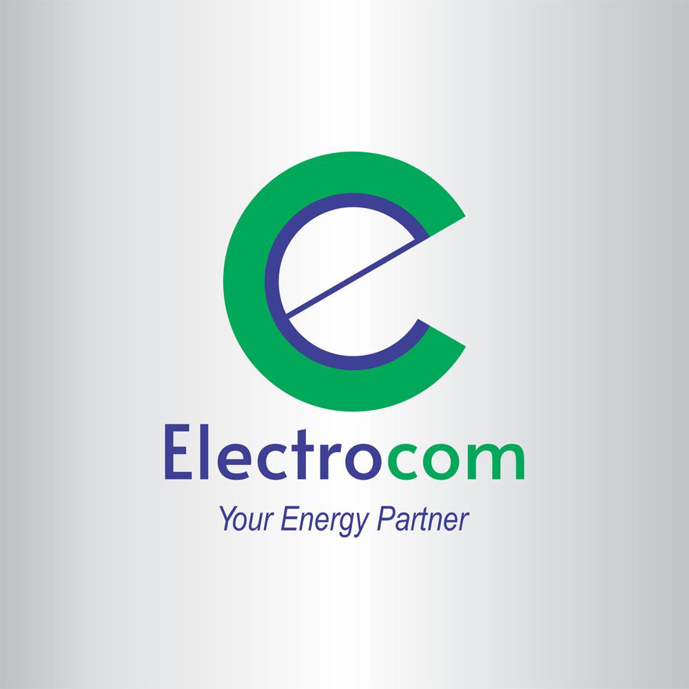
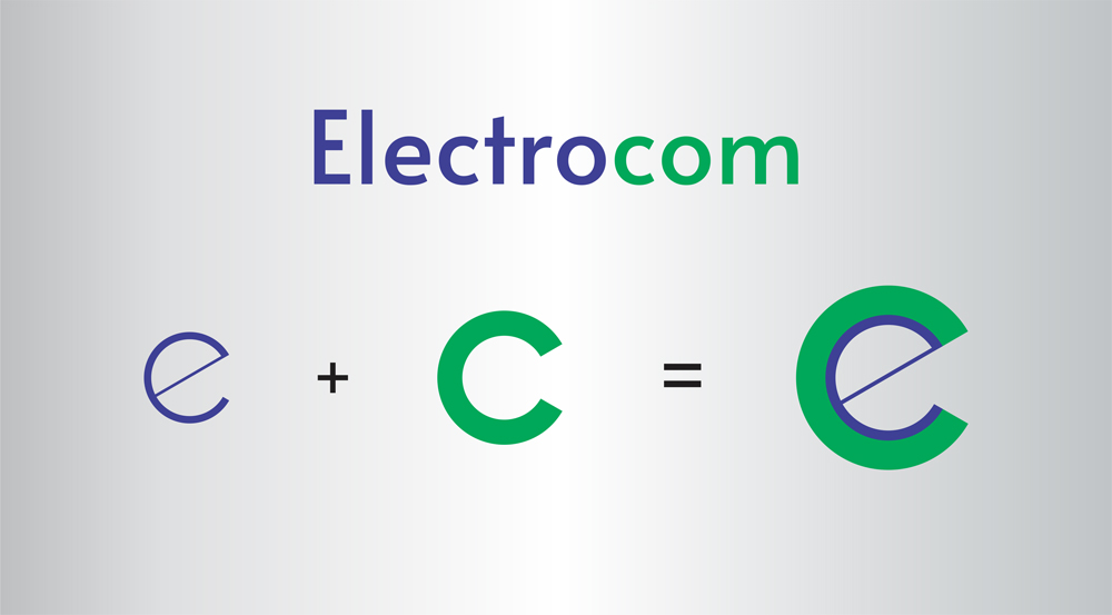
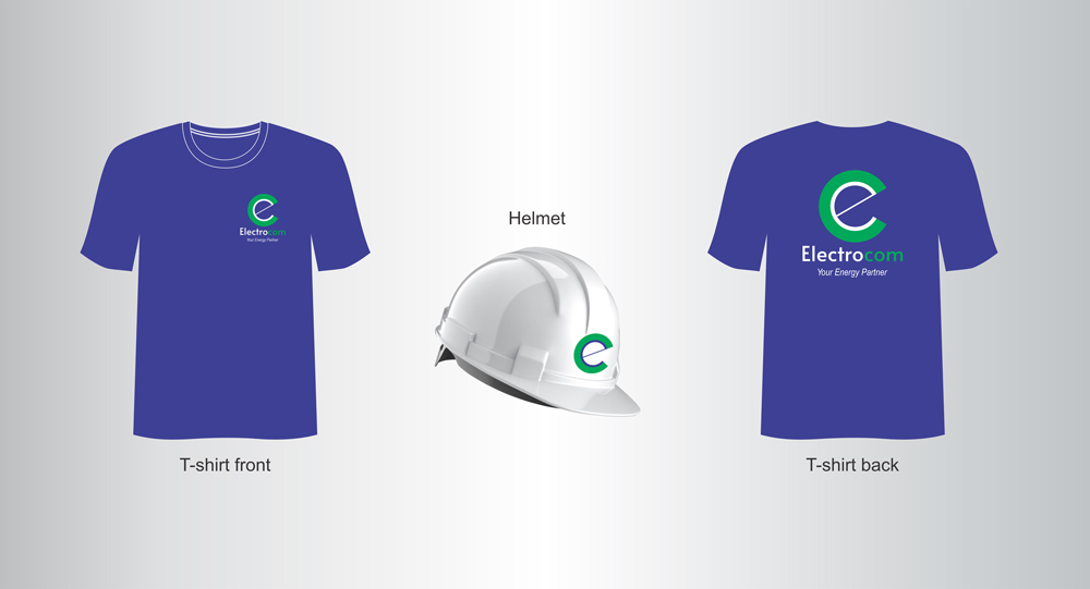
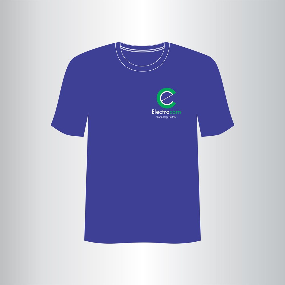
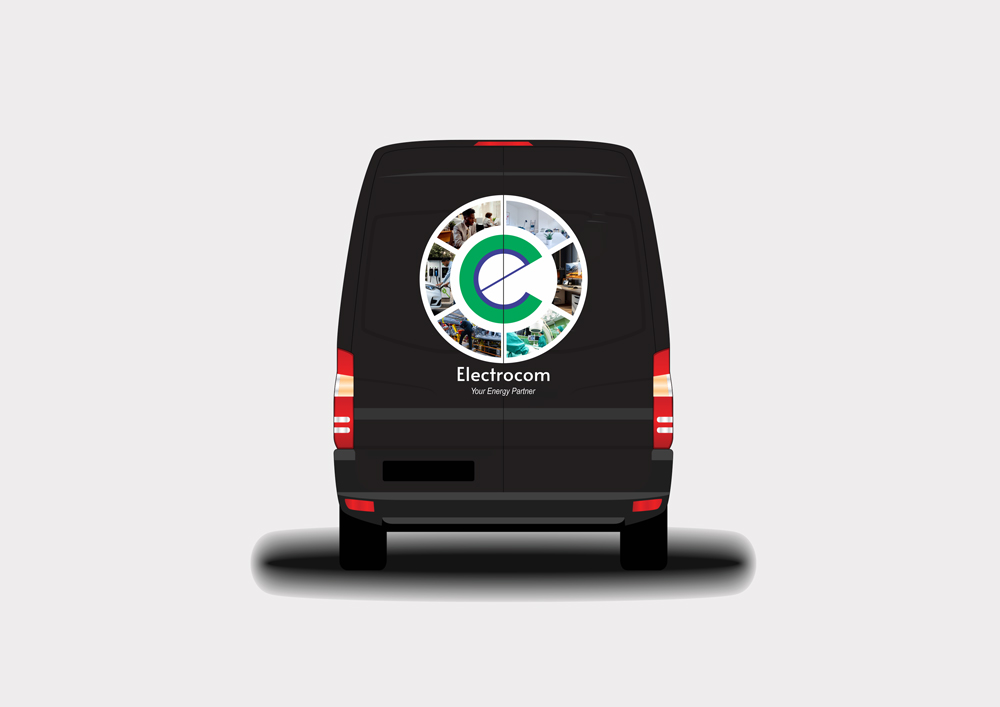
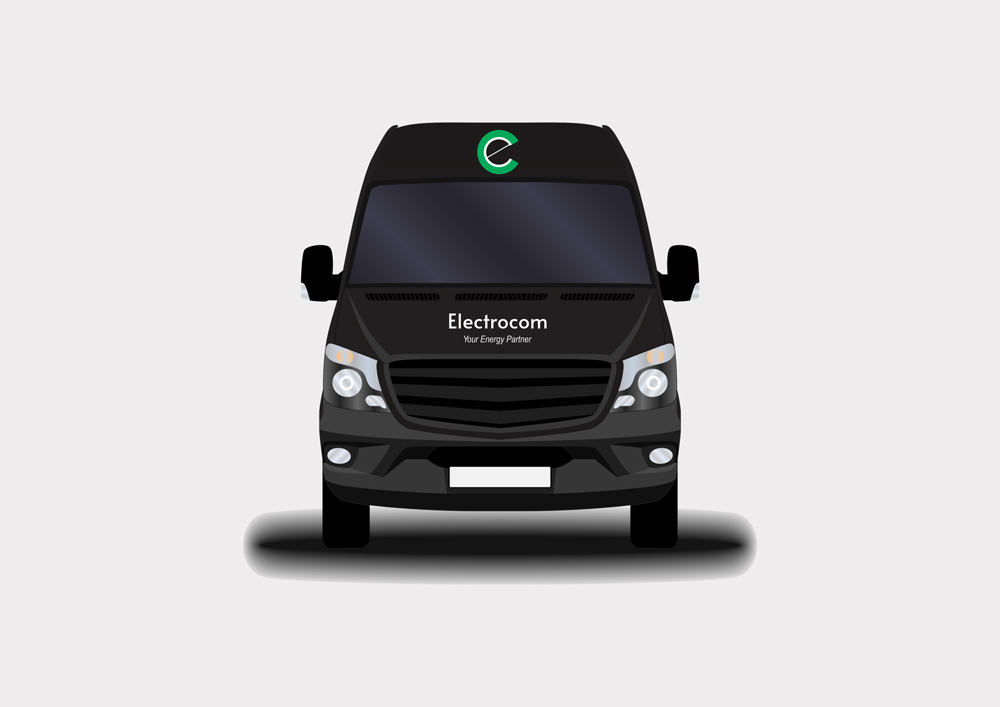
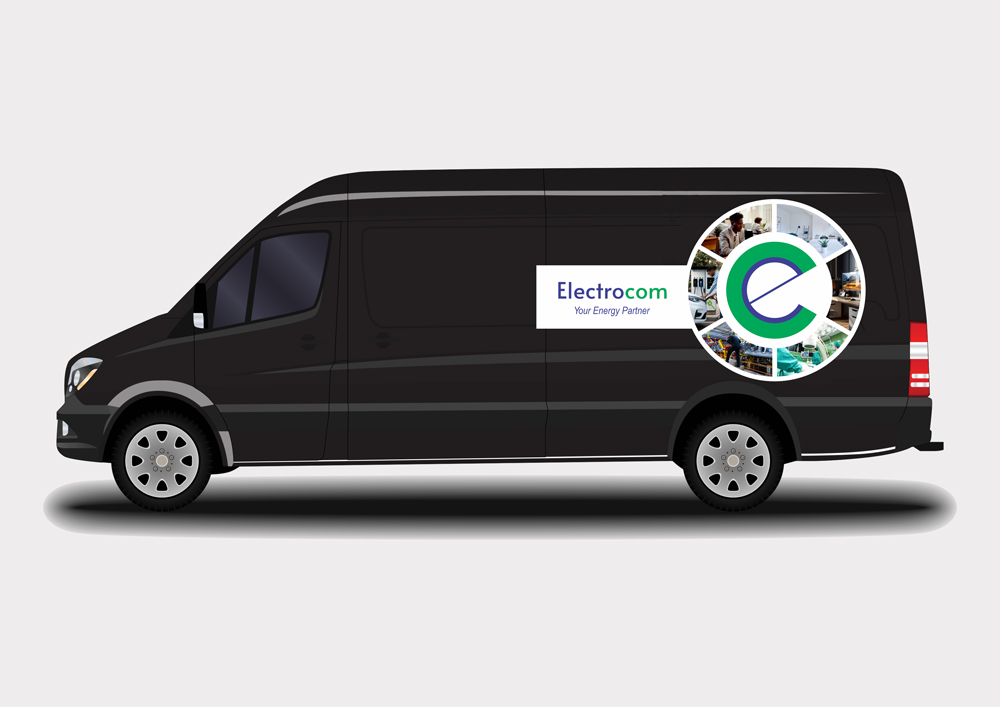
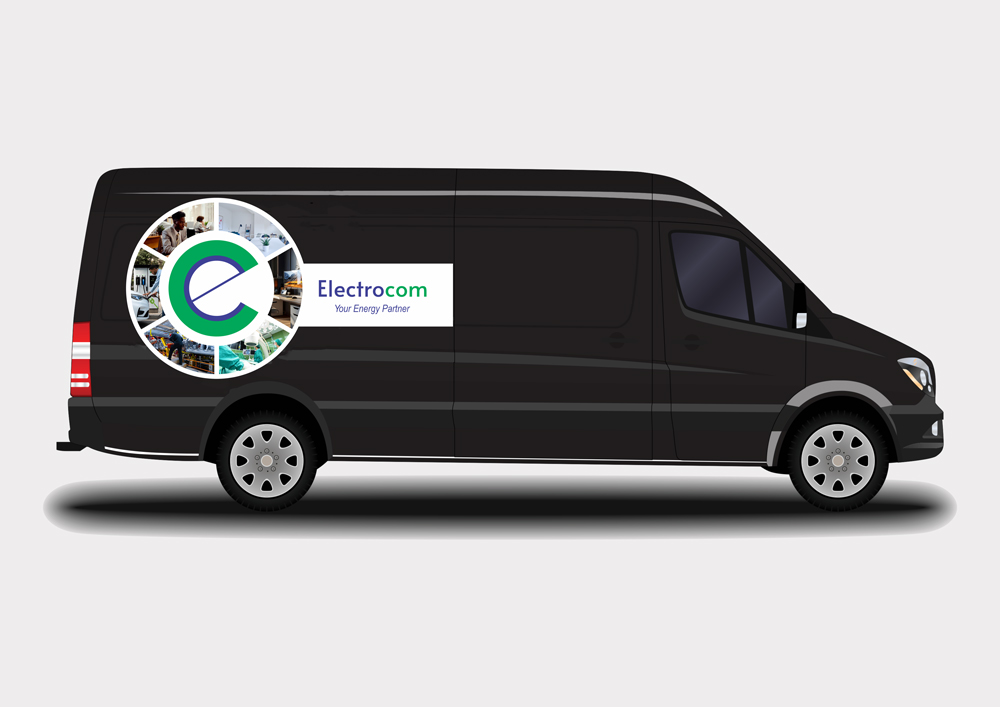
I used the letters "e" and "c" fused into one, to create the timeless abstract letter logo that represents the Electrocom brand. I also used the colours blue (#3E4095) and green (#00A859) to represent the strength, reliability, and commitment of the brand to provide clean and renewable energy. The Electrocom font (Alata) and italicized tagline font (Arial Narrow) communicate clarity of purpose and procedures in delivering energy to partners.
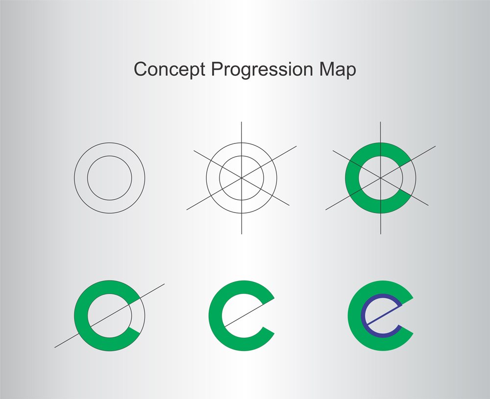
This logo design process commenced with two perfect circles of two sizes and three straight lines crossing at the middle of the centered circles, splitting them into six equal parts. I've attached a concept progression map to my entry submission for clarity.
This logo can easily be rendered in 3D text, animation, and all forms of print media.
I'll be happy to see the Electrocom brand come to life across Africa, beyond winning this competition!
Like this design? Vote it up!

