Thuli Khumalo – Electrocom
Designed By
Thuli
Website
About This Design
I stumbled upon this incredible competition through my Instagram algorithm. At first, I hesitated to participate due to my own self-doubts, but then I remembered my mantra: "Let my craft speak when words fail me." I chose the Electrocom brief because it tackles a highly relevant issue — the role of an electricity provider in bringing hope to everyday South Africans.
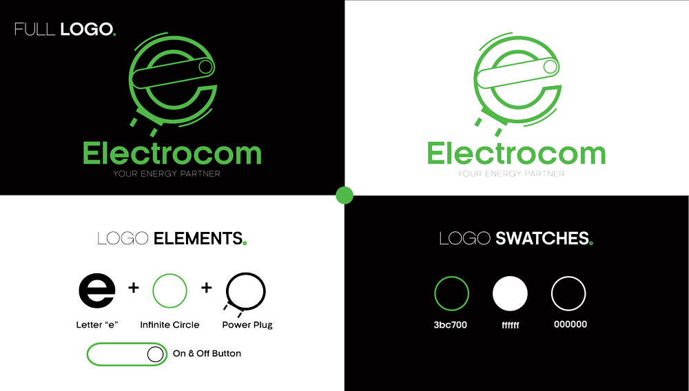
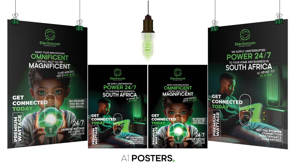
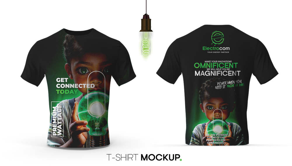
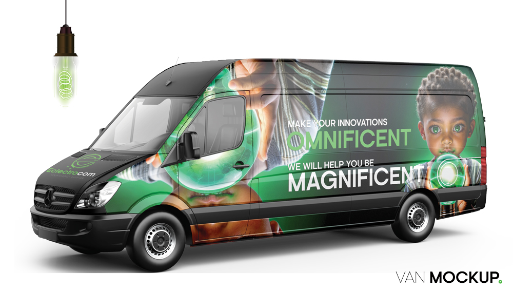
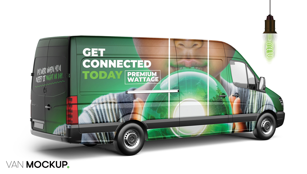
For my design, I aimed to create a futuristic logo that works seamlessly across all media formats. My design can be used as separate elements — typography and vectors — or combined as one cohesive logo. Either way, it maintains its impact. I centered the design around the letter "E" from "Electrocom," integrating an on/off button in the middle and a plug element to emphasise renewable energy and rechargeable power. The color scheme is rooted in green and black: green for renewable energy and black for the frequent load-shedding we face. This contrast symbolises hope in dark times, the core message I want to convey.
Like this design? Vote it up!

